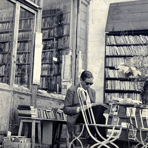
 Time was when bookshops appealed for being old-world and fusty with their confusing layouts, musty smells and eccentrically bookish proprietors. The archetype might be Paris’s Shakespeare and Company bookshop, founded by Sylvia Beach in 1919 and frequented by the literati of the day, from Ernest Hemingway to James Joyce. Fast-forward to the 1990s, by which time bookshops had become megastores incorporating cafés and comfortable leather armchairs where customers could browse for hours and sip cappuccinos.
Now a new breed of bookshops is emerging which, luminous, spacious, easily navigable and thrustingly contemporary, is the very antithesis of the trad bookstore. Changing tastes in architecture and interior design are partly responsible for this trend, but so, too, are economics and new book-buying habits. Fierce competition from online retailers, cut-price supermarkets and e-books has seen the market for physical books dwindle and caused many bookshops to close, but booksellers are fighting back. And one of their tactics is to hire cutting-edge architects to design shops with an alluring, contemporary aesthetic which, the hope is, will help attract punters day and night.
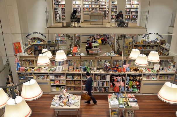
A case in point is Foyles on Charing Cross Road, London, the time-honoured bookshop once famous for its quaintly chaotic warren of rooms with books piled up everywhere — not just on shelves but in nooks under tables. Last June, however, the mammoth store relocated to brand spanking new premises in an equally famous landmark — the former building of Central Saint Martins art school a few doors down. This legendary art college was once as labyrinthine as the Foyles of yore, but has now has been transformed by architects Lifschutz Davidson Sandilands into a light-filled, white-walled, 37,000-sq ft bookshop on eight levels connected by staircases that afford unencumbered views of the floors above and below.
Interviewed recently in the Financial Times, Foyles’ chief executive Sam Husain said that one reason why the shop moved was that its original layout was old-fashioned — “higgledy piggledy and inefficient, a maze”. By contrast, the new shop boasts four miles of orderly bookshelves and stocks over 200,000 titles. And if its interior is clean-lined, minimalist and easy to navigate, it’s partly because it needs to be geared to convenience in an age when customers are used to snapping up goods online at lightning speed. Punters can also use an in-store mobile search tool to see if a book is in stock and, if so, where, with the aid of an interactive map, it can be located.
Reassuringly Foyles itself is expanding: last year, it opened a branch in Waterloo station and, next September, is opening one at Grand Central Birmingham, Birmingham’s new shopping centre. Foyles also has a shop in Bristol, and its recently refurbished store at London’s Royal Festival Hall has seen a steep rise in book sales.
This augurs well for the future of the physical book, though some argue that its longevity is now dependent on a new and growing market for books as luxury products — gorgeously designed tomes that are treasured for being good-looking and tangible.
Last year, I interviewed Iwona Blazwick, director of London’s Whitechapel Gallery and a former commissioning editor at book publisher Phaidon Press, about future trends in design. One of her predictions was for more artists’ books. “Perhaps our global tsunami of virtual images and mass-produced objects will lead us to value the unique, the regionally specific and handmade,” she said. “As print edges nearer to the abyss, artists’ books and books about art are becoming more desirable as objects we can touch, smell and gaze upon — they stop rather than accelerate time.”
Another survival tactic for this new generation of bookshops is to operate as a cultural centre not just a bookstore. To use that retail cliché, shops today must offer an “experience” — not just a “shopportunity” — if they are to succeed. Foyles epitomises this approach, incorporating as it does an art gallery, a café and an events space for receptions and talks. According to Matthew Brown of retail trend agency Echochamber: “Shops are no longer about buying stuff — we can get that online. They’re about connecting with the brand in deeper ways through hospitality and service....”
Waterstones has also pulled out all the stops to make its shops more seductive than conventional bookshops. Its flagship store on Piccadilly - the largest bookshop in Europe, is housed in the glamorous Art Deco building once occupied by department store Simpsons. The shop offers a variety of cultural and gastronomic attractions, thanks to an imaginative and flexible use of some of its spaces.
“With the rise of digital publishing, we’ve had to rethink how the shop is used,” says manager Luke Taylor. “Our ambition was to turn it into more of a social space, where people like bloggers hook up. We’ve overhauled parts of the store, the most obvious bit being the basement. There’s now a café there that morphs into a wine bar at night. The reception area to our head office is here too and this doubles as an events space for book launches, talks and screenings. There’s another café on a mezzanine level on the ground floor where artists can show work. We’ve also partnered with 5th View, a restaurant and cocktail bar, on the fifth floor.”
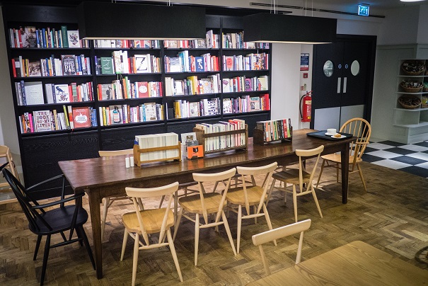
Taylor adds that many Waterstones branches (there are 28 in the UK) now feel like cafés just as much as bookshops. Waterstones owns Hatchards, which last year opened a branch at St Pancras International station in London. “Hatchards has always been a social space,” says Taylor. “It was originally a literary coffee shop that sold political pamphlets. Now our St Pancras shop serves wine, coffee and cake, and holds author events and book signings.”
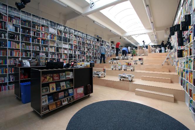
Another forward-thinking bookshop-cum-café, Alexis, in Bratislava, Slovakia - designed in 2010 by architects Martin Jančok of practice Plural and Aleš Šedivec of Totalstudio - also hosts cultural events. One of its main features is a staircase extending the full width of the shop which doubles as an informal auditorium where customers can perch to read books or attend talks, concerts and other events.
Brazil, too, is seeing the emergence of a new wave of bookstores with a decidedly contemporary aesthetic. But while this might suggest that Brazil is a nation of cultured bibliophiles, some believe that commercial motives alone are driving this boom.
“Unfortunately, I don’t think there’s a great cultural movement in Brazil promoting reading,” says Laura Guedes, an architect at Brazilian practice Studio MK27. “I think the emergence of large, interesting bookstores here is mainly due to two reasons. The first is that bookshops as businesses have diversified their product ranges, increasing their scope. Bookstores like Livraria Cultura in São Paolo also sell electronics, games, music-related items, DVDs, toys, stationery... And they function as event and meeting spaces for book and product launches. The second reason is that people don’t use tablets and e-books that much yet in Brazil.”
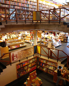
A seminal example of the country’s new generation of bookshops is São Paolo’s Livraria da Vila. Designed in 2007 by Brazilian architects Isay Weinfeld, this bridges the style of traditional bookshops and contemporary ones. While the current vogue in bookstores is for gallery-like, white walls combined with honey-toned wood and pops of bright colour, Livraria de Vila plays with stark tonal contrasts: its shelves are in white or a cigar-brown wood redolent of gentlemen’s clubs. Yet, being open-plan, the shop anticipated the future trend for transparent interiors.
More modern and clean-lined is the aforementioned, 2,500-sq m Livraria Cultura, completed in 2013. Designed by Marcio Kogan, Diana Radomysler, Luciana Antunes, Marcio Tanaka and Mariana Ruzante of Studio MK27, and incorporating an exhibition space, conference area and garden café, it’s as much a see-and-be-seen hangout as a bookshop. It also recalls an upscale department store or elegant airport lounge with its escalators ascending to a top-floor, open-plan, double-height space with 21m-wide, tiered, wooden benches where customers can hang out with friends or read. White bookshelves incorporating LEDs, white laminate surfaces and glass handrails on the staircases all contribute to the shop’s luminous, transparent feel.
There are similarities between Livraria Cultura and another Brazilian bookshop — the Rio de Janeiro flagship store of Brazilian bookseller Saraiva, designed by architects Arthur Casas in 2013. After all, it has a double-height, open-plan ground floor and a gleaming escalator. With its white walls and wooden shelves, its décor is neutral but for one touch — the books on the top shelves are arranged by colour rather than category, creating an unexpectedly pop, rainbow-hued effect. The intention behind the soaring double-height space and expansive ground floor is to create the feeling of a public square crossed with a library — a social space that encourages people to congregate and hang out. The shop also has two basement levels. The upper one sells electronic goods, while the lower one is devoted to children’s books, and features a funky, rainbow-striped ramp — providing access to shelves — and beanbags to recline on and read.
In short, bookshops are turning over a new leaf as they battle to survive in the internet age. Today, they need to offer an environment that is refreshingly contemporary, welcoming and practical, where books and other items can be easily found.